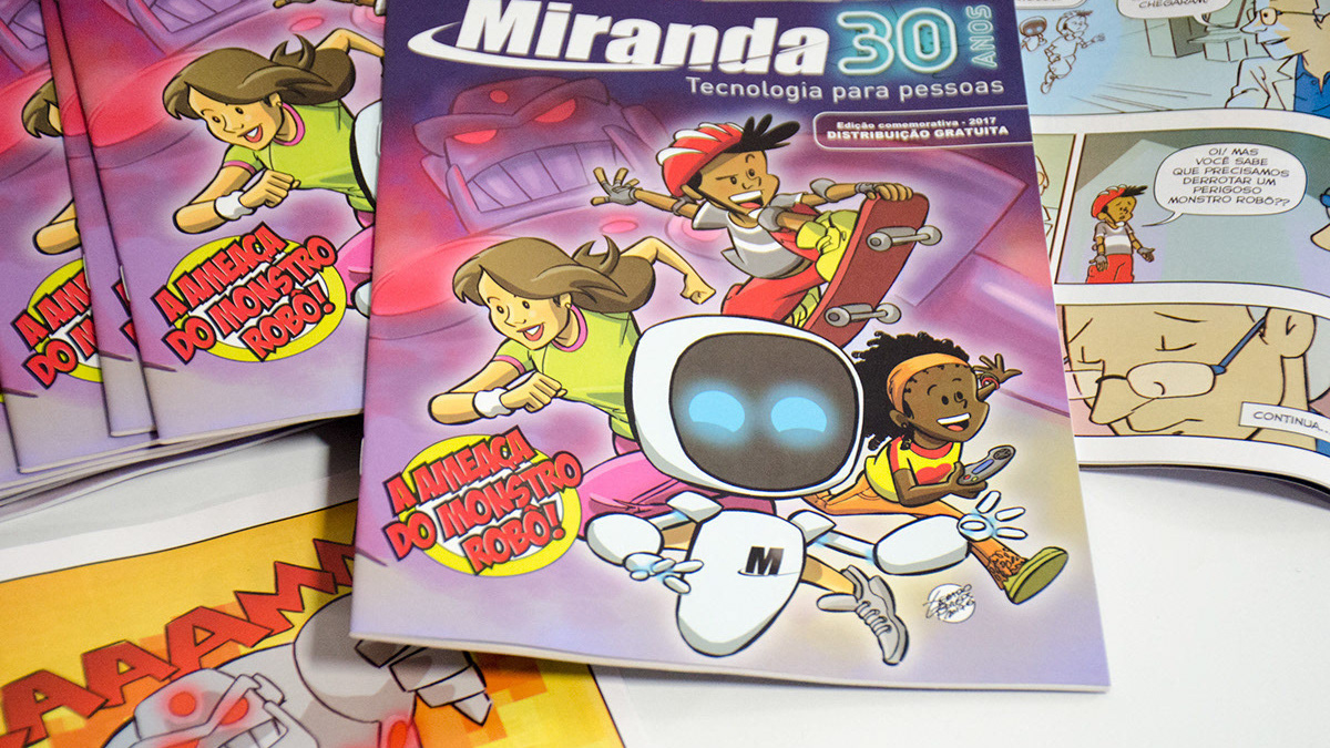
Miranda's 30th Anniversary
Successful Ad Campaign
Successful Ad Campaign
In 2017, Miranda Computação completed 30 years, a milestone in the life of any company, and was looking for a concept that could translate as best as possible that special date for the biggest sales campaign of the year: The Miranda's anniversary campaign. Something to reflect the 30 years of a company, at the same time that it proved to be a commemorative campaign, flashy, colorful, that could stand out from the other campaigns during the year.
We needed to think what it was we were looking for. We needed a concept, and the concept is the key to the advertising campaign.
"Concept is key to the
advertising campaign"
Going deep into Miranda's soul and understanding its foundations and history was essential.
We arrive at the following conclusion:
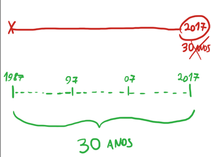
- 30 years is a space in a complete timeline.
- The 30 years of Miranda not a specific point in 2017 where it is birthday. But a whole construction of 30 years to here.
- 30 years is a space in a complete timeline.
- The 30 years of Miranda not a specific point in 2017 where it is birthday. But a whole construction of 30 years to here.
It needed some element that was present from the 80's until today, that could really translate each of the past 29 years. From your birth to your present state.
Studying references and design tendencies, we observe a style that is being used massively in cinema, TV and other media. The style is known as Retrowave or Synthwave.
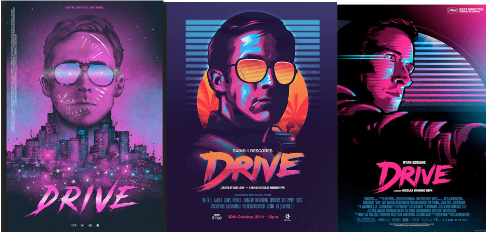
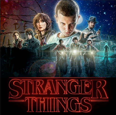
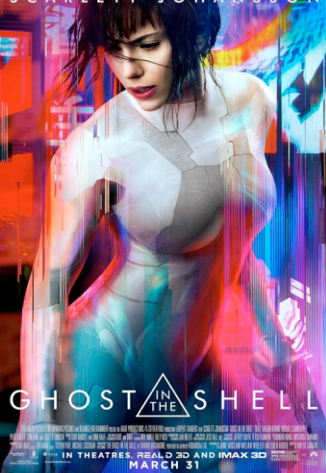

"Synthwave, or Retrowave, is a musical style that emerged in the mid-2000s influenced by music and soundtracks of the 1980s. Visually speaking, Synthwave gained a perspective of retrofuturism, emulating science fiction and action scenes from the 1980s."
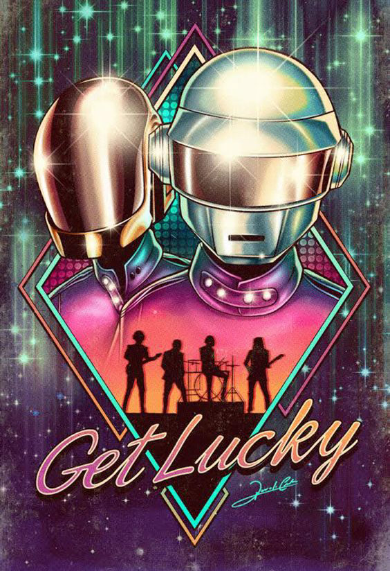
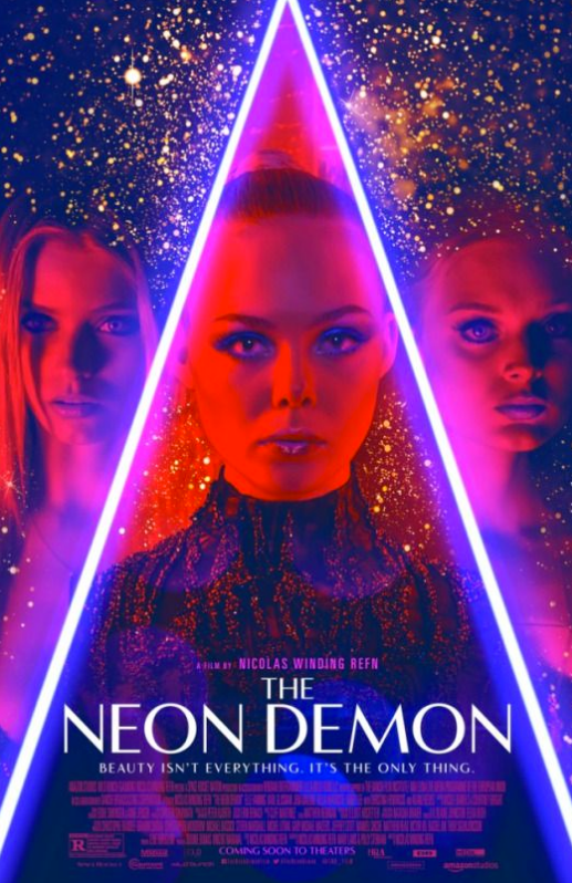

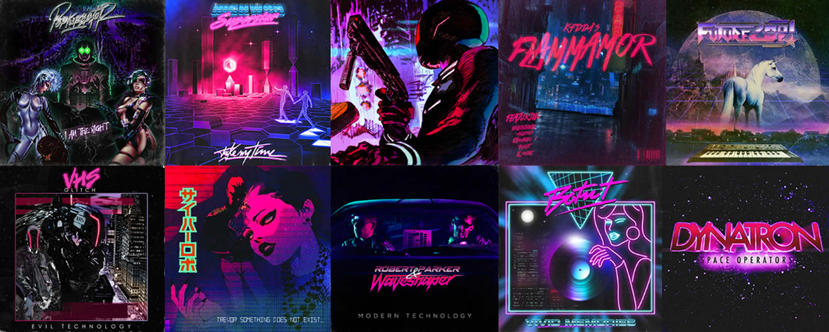
This style is marked by the contrasts of pink, blue and black and lots of neon color. The references are retro and the figures resemble the obscure, the serious. They remind us of the future of the past. Cyberpunk - What was to be the image of a mysterious future has become the comic image of a playful past. The proposal of Retrowave is to be purposely ironic, irreverent and cliché (purposely cliché).
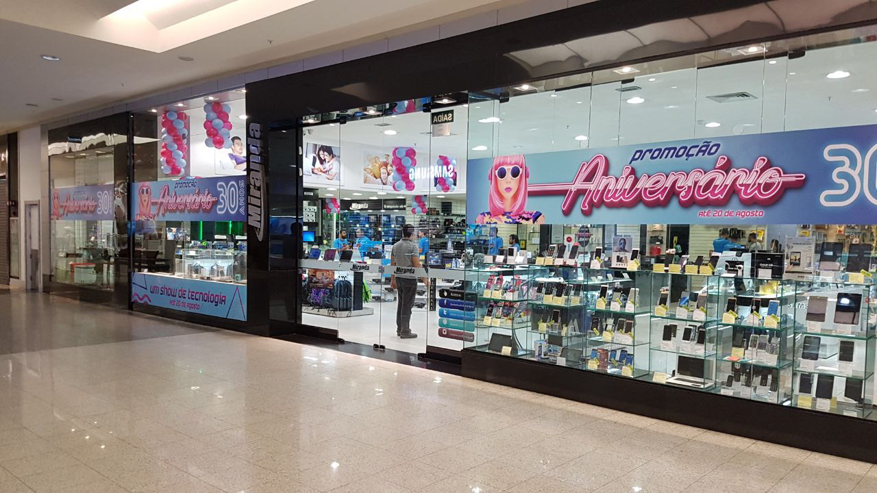
Looking at these elements, we have seen that the Neon is an element that emerged in the 80's, very striking on Las Vegas street signs, in diners, casinos and cheap hotels. It is not only a virtual element, but a tangible piece, palpable and real. Despite its many years of existence, neon continues to be used today, surviving time, especially in design. And now, even more, as a worldwide trend.
Miranda Computação was born in 1987, in the golden decade of neon. And like him, he survived time, adapting and modernizing himself. We found the key to our campaign. And so it was decided that this would be the benchmark for the biggest campaign of the year.
Miranda Computação was born in 1987, in the golden decade of neon. And like him, he survived time, adapting and modernizing himself. We found the key to our campaign. And so it was decided that this would be the benchmark for the biggest campaign of the year.

Brand creation study.
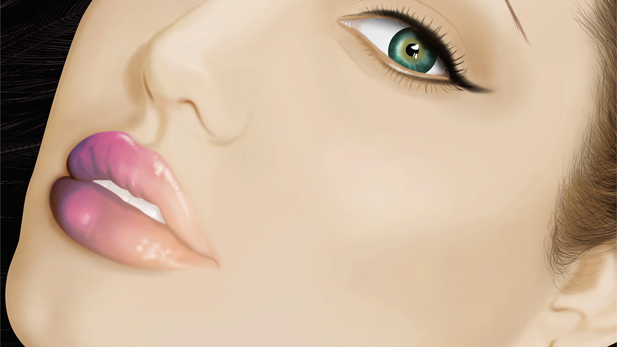
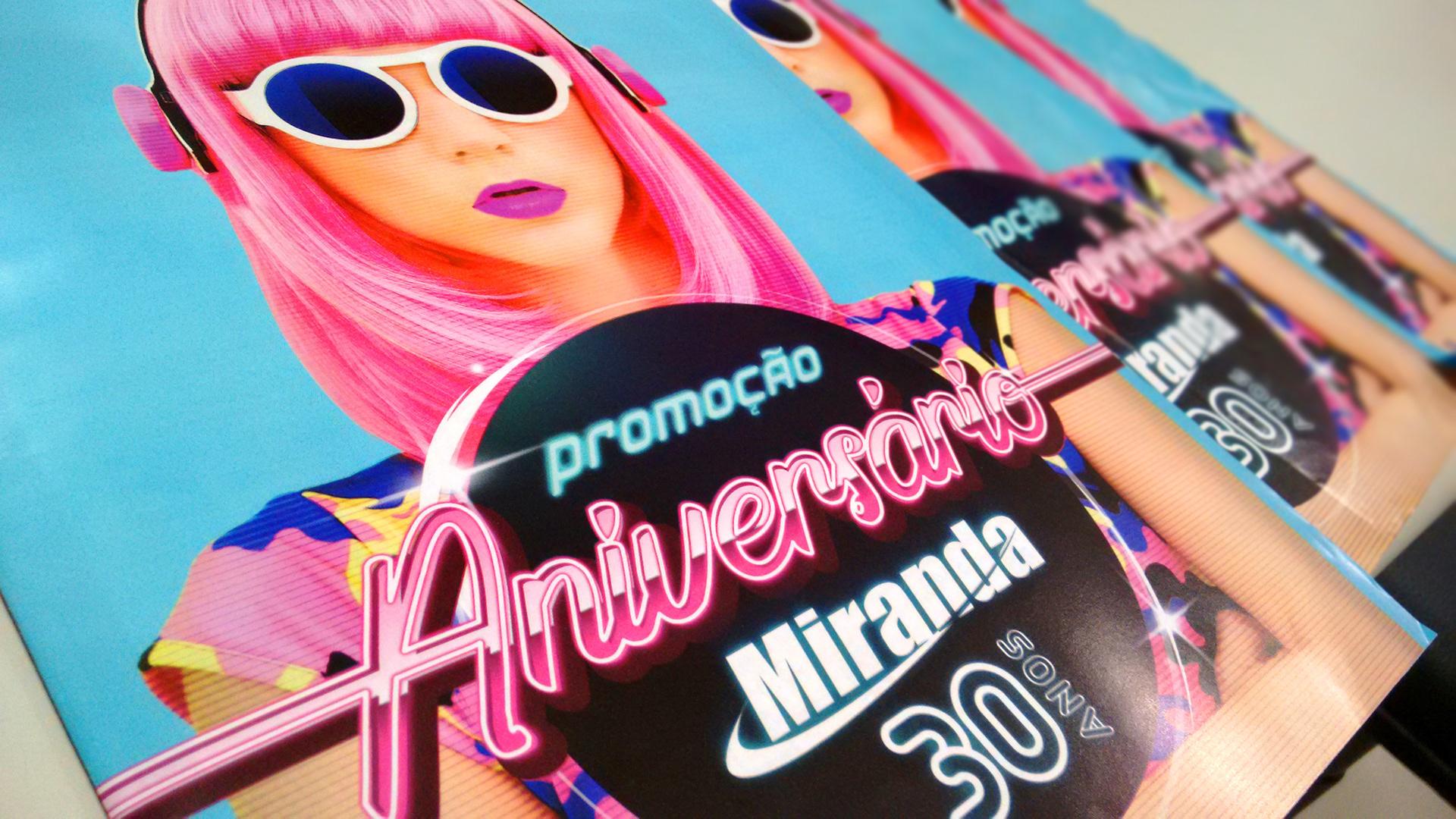
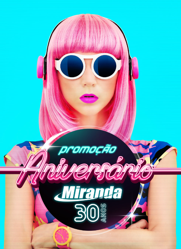
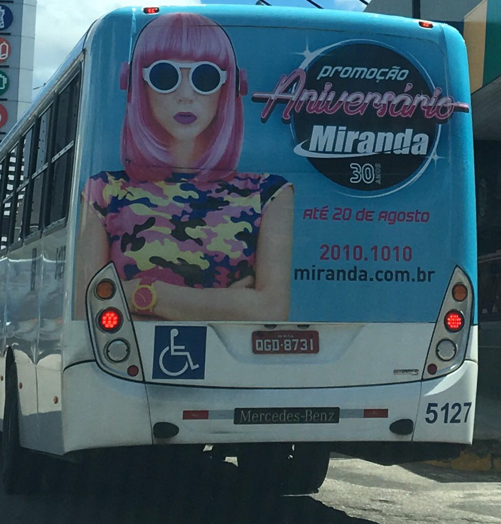
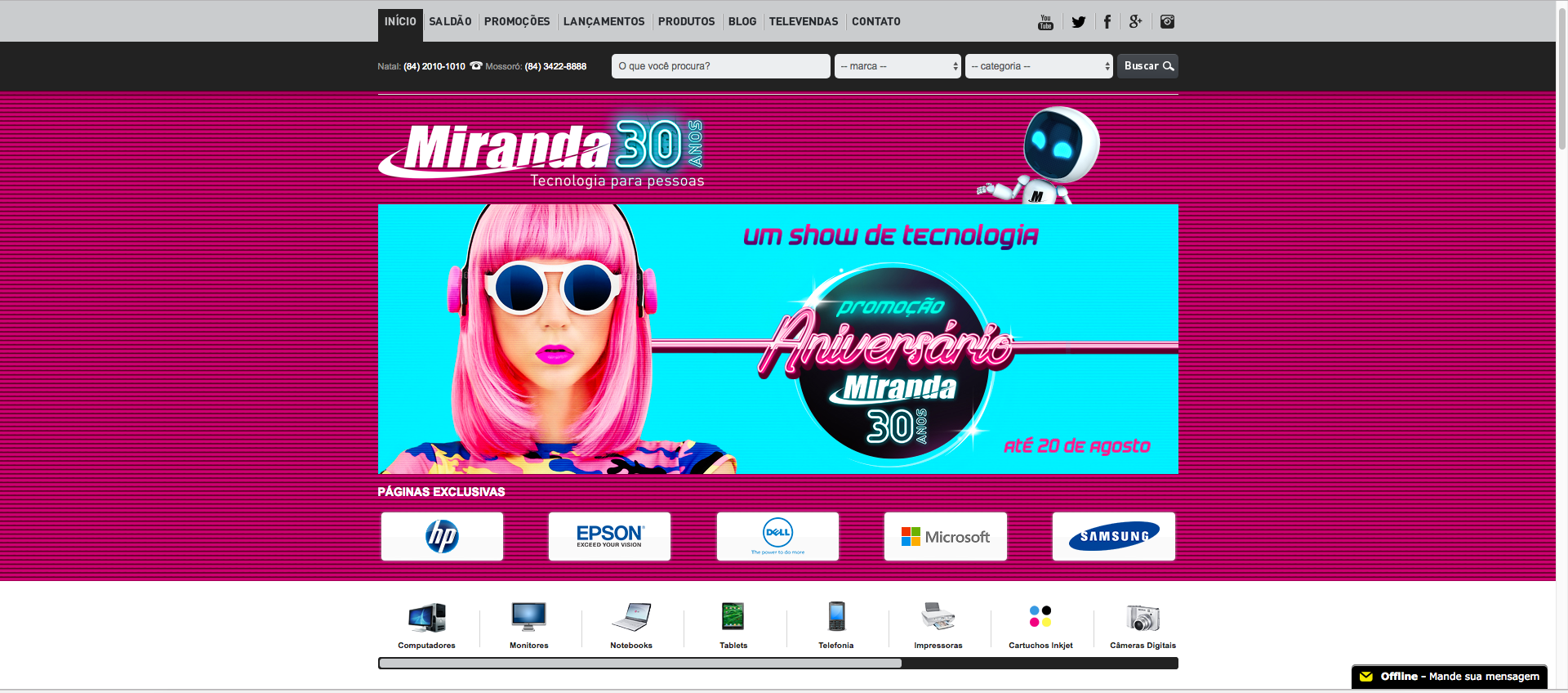
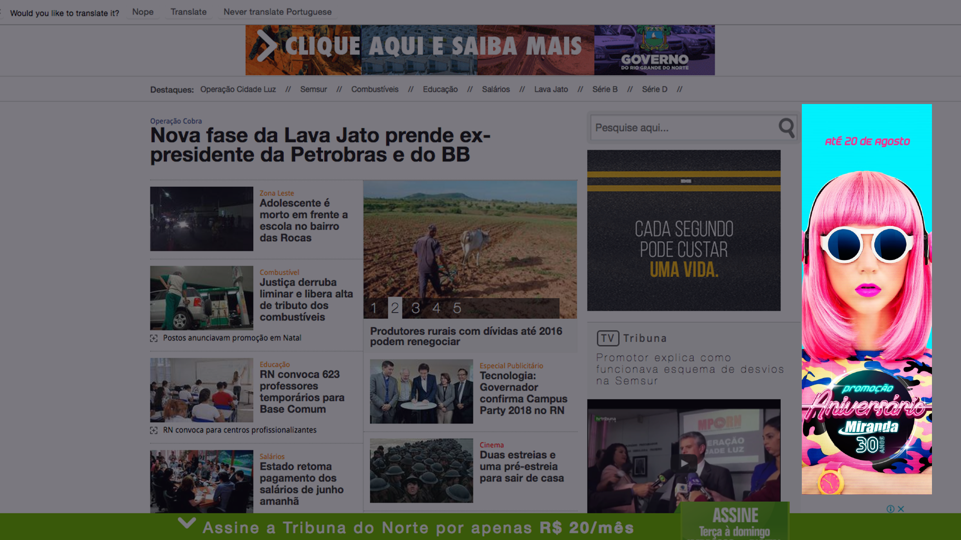
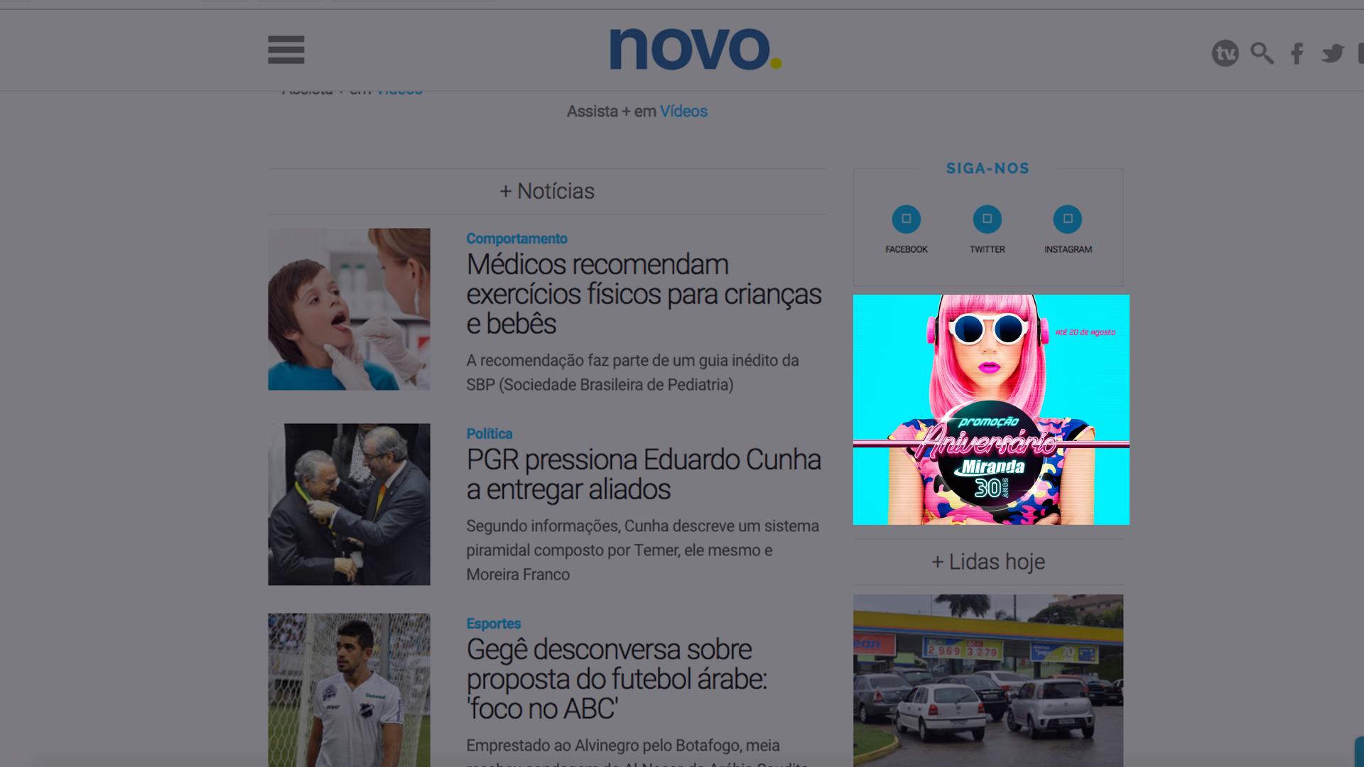
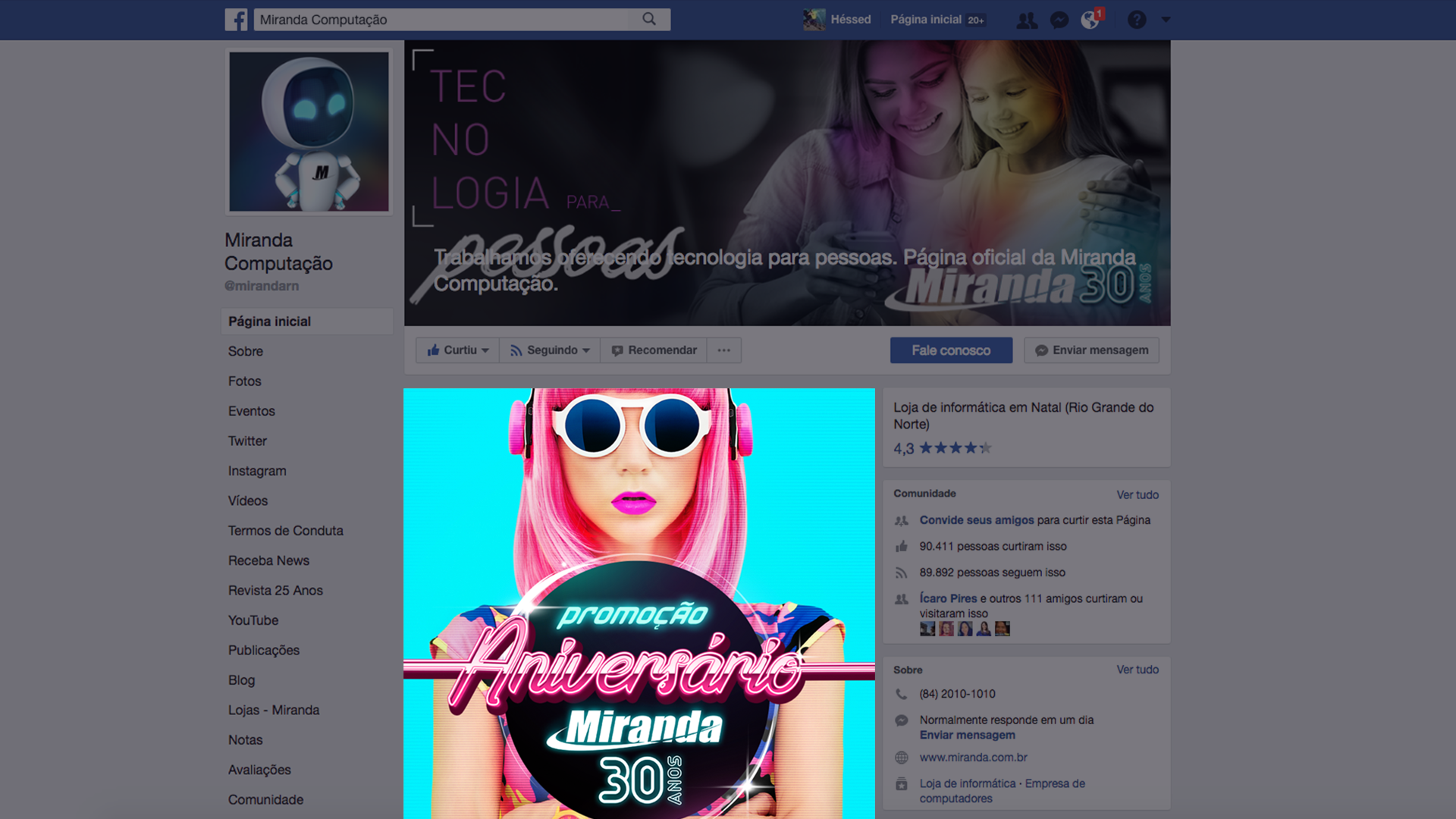
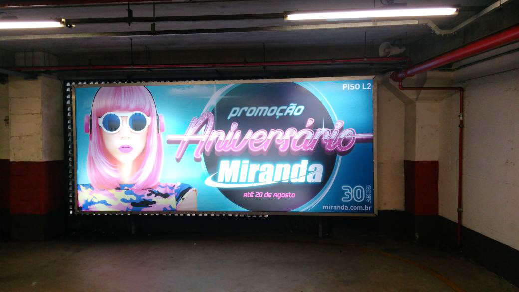
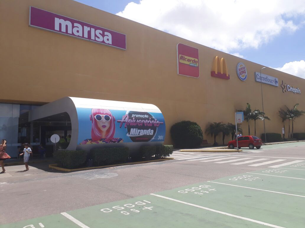
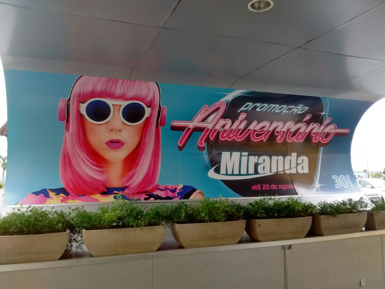
The central Visual Key of the campaign was born as well: A "doll" of pink wig, unconventional headphones and with retro look. Serious, giving his countenance a touch of mystery. Running away from the conventional because all the promotional campaigns have people smiling on the cover. However, one of the demands was that the cover should be dazzling, with colors that grip the viewer's eyes. Then greater importance was given to the rose and the blue, without eliminating the black, belonging to the style Retrowave.
The logo is what most should identify the reason: "Aniversário" (It's mean birthday) with the letters forming a neon sign going from end to end.
The logo is what most should identify the reason: "Aniversário" (It's mean birthday) with the letters forming a neon sign going from end to end.
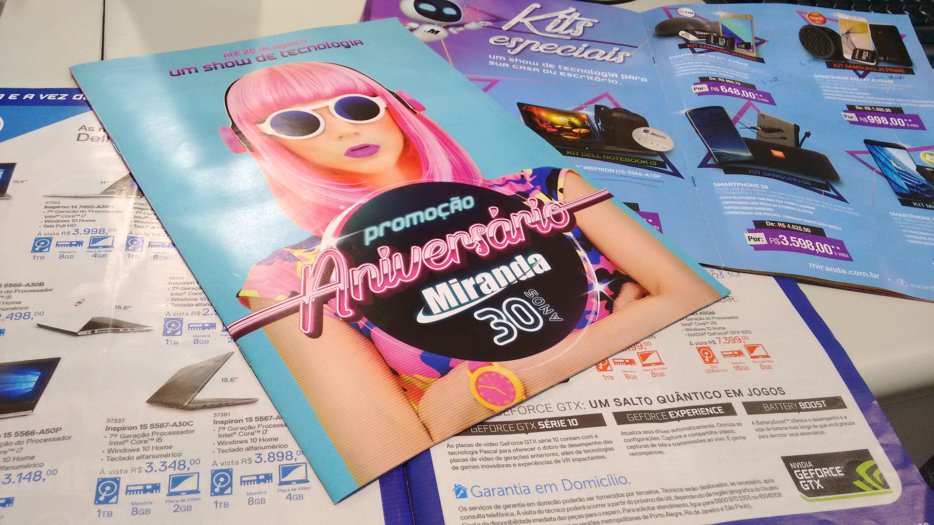
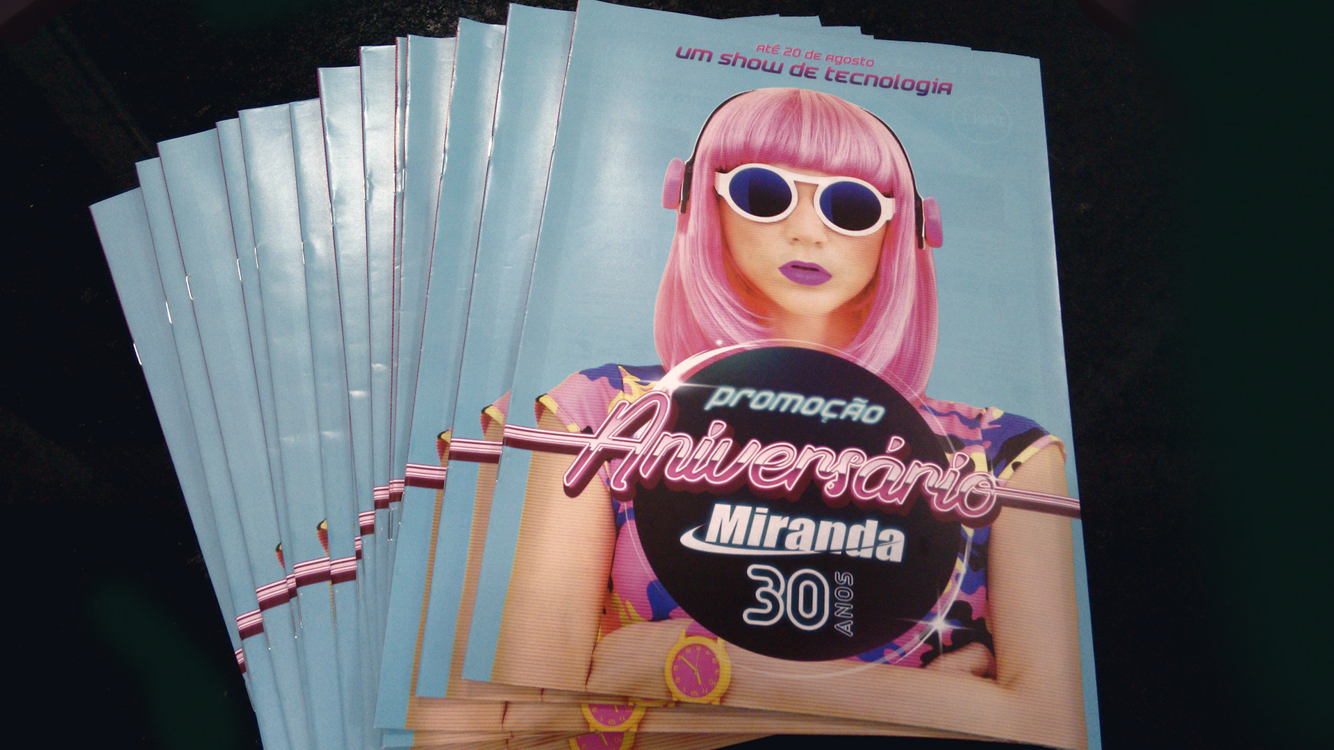
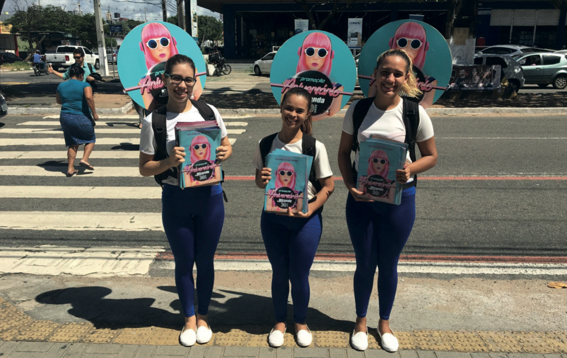
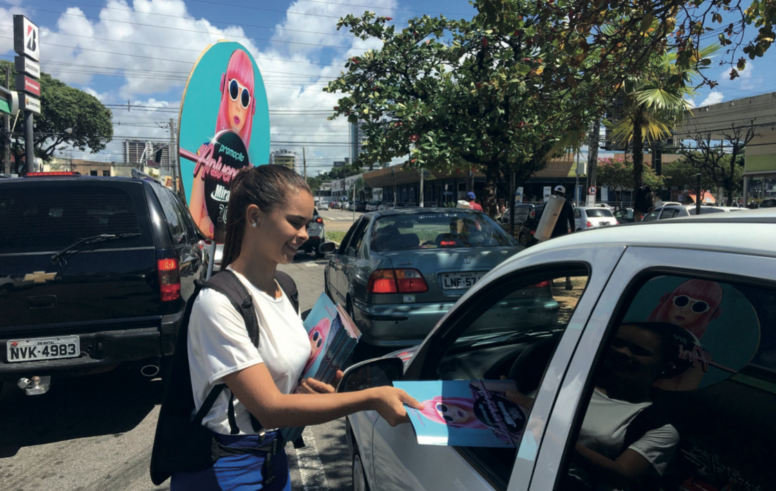
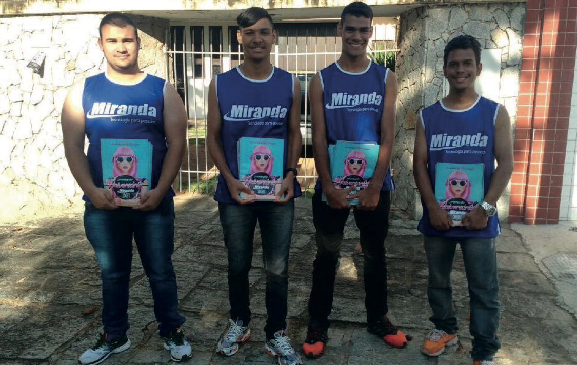
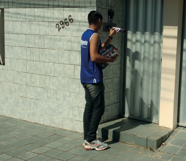
We then created the cover of the centerpiece, the catalog of products of 9 slides and 36 pages. Printed 70 thousand times and placed in newspapers, delivered to homes and at traffic lights and distributed in Miranda stores.
In commercial terms, it was the largest catalog ever made at Miranda Computação, which had a record participation in the number of participating suppliers. International partner brands are always present, such as Dell, Samsung, Lenovo, Acer, among many other brands linked to technology.
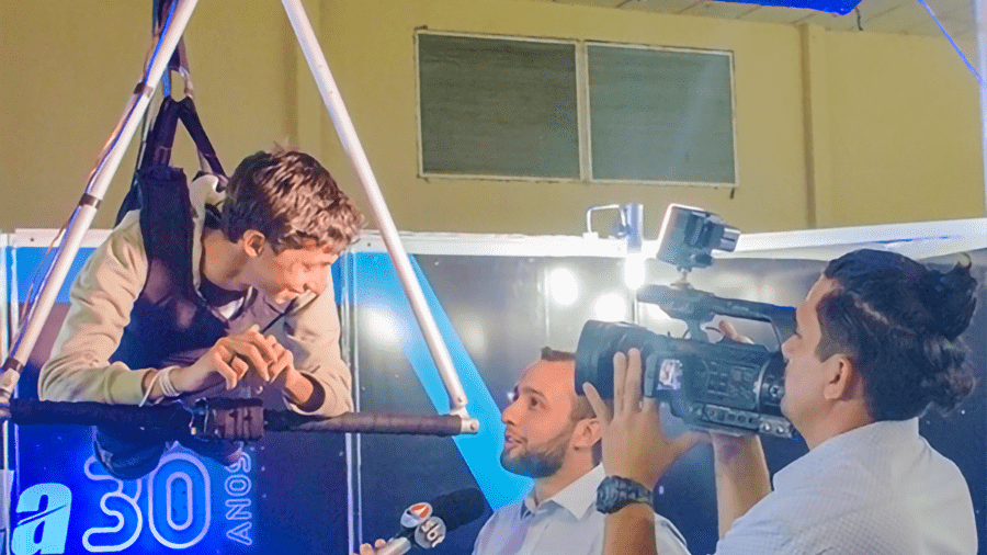
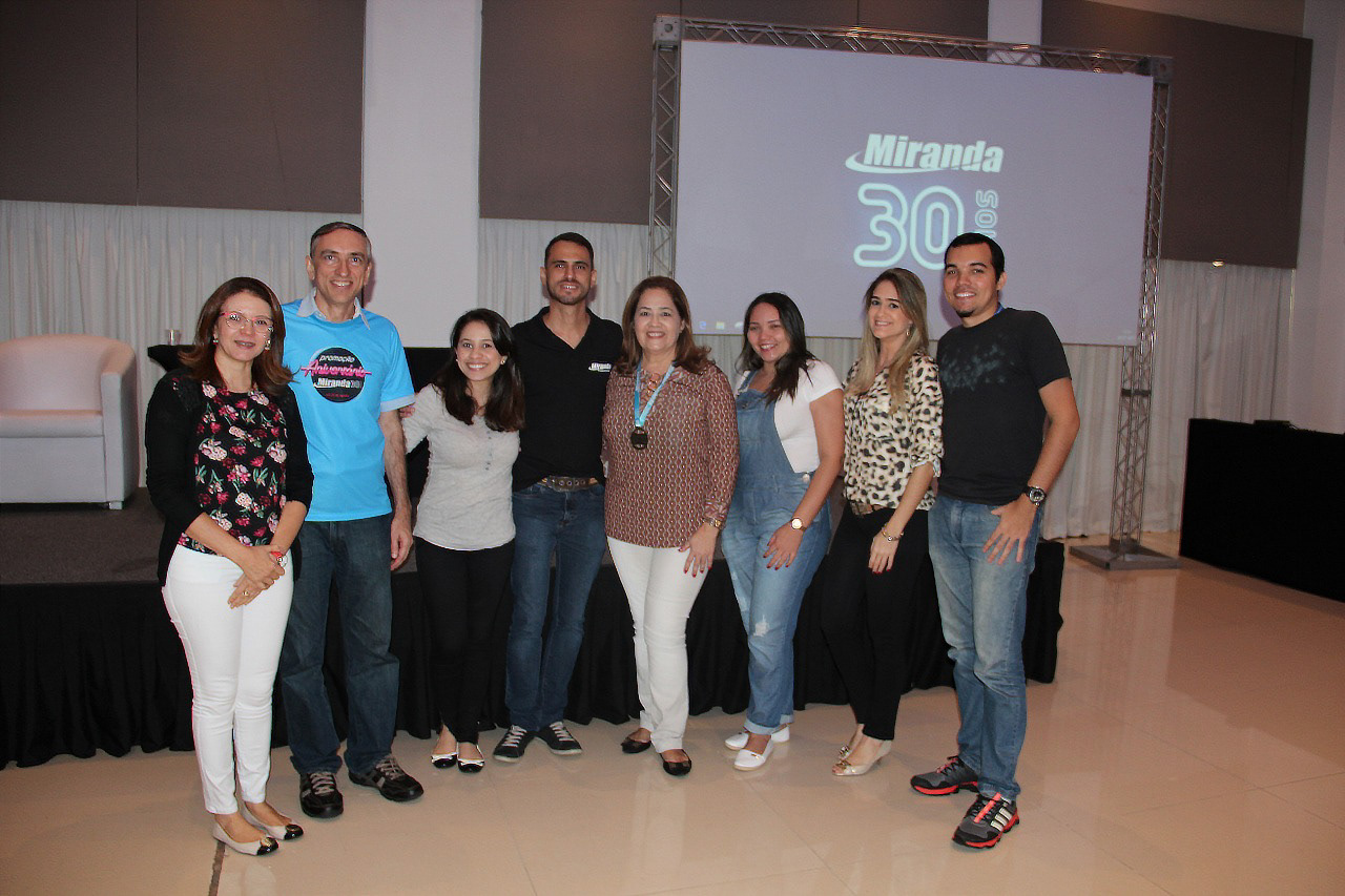
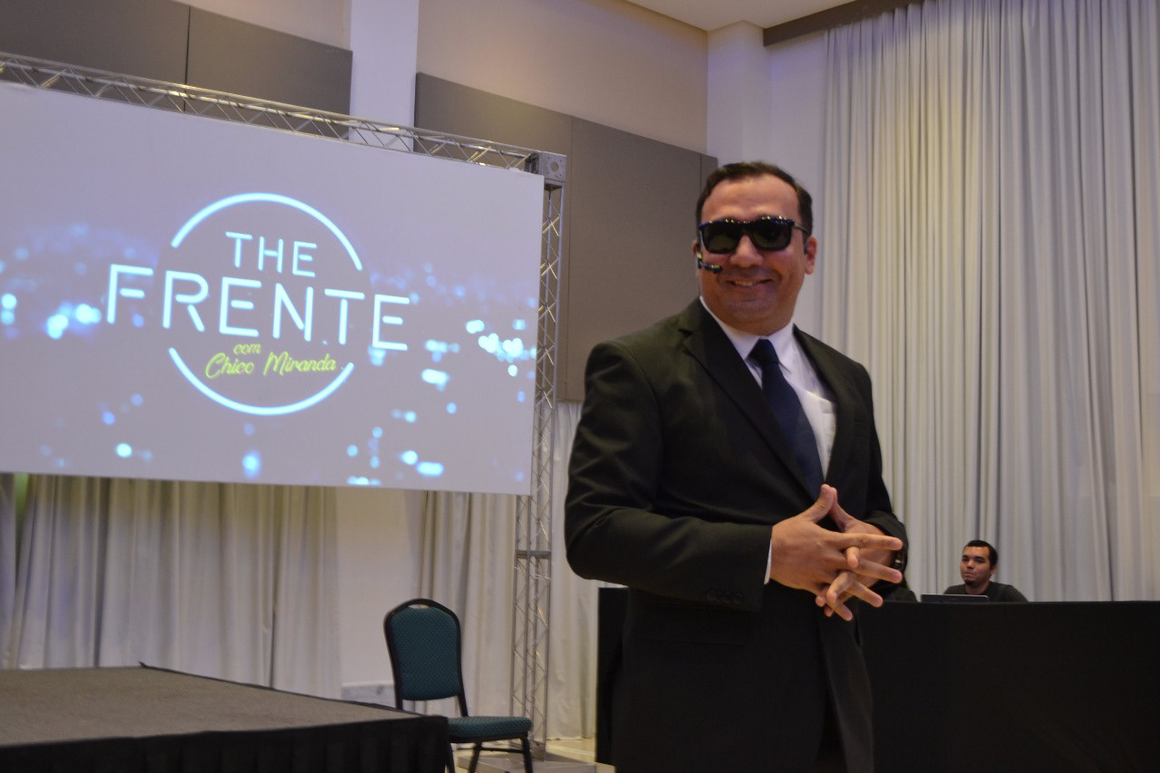
In order for the campaign to be a success, the marketing team prepared a great meeting among employees, which we call "The Great Miranda Meeting", an event that aims to present the company's largest commercial campaign, anniversary campaign, all years.
On that occasion, there was an exciting song that played the collaborators, a moment of funny skits, company history, giveaways, awards and recognition among employees. Everything for the company to breathe the sales campaign and enter the celebratory atmosphere. A glorious and unforgettable moment.
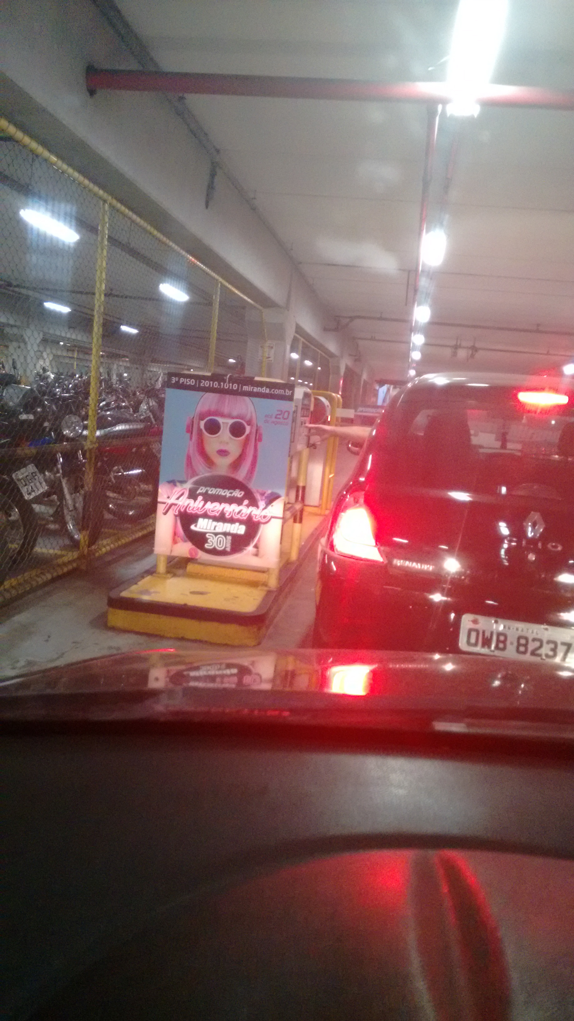
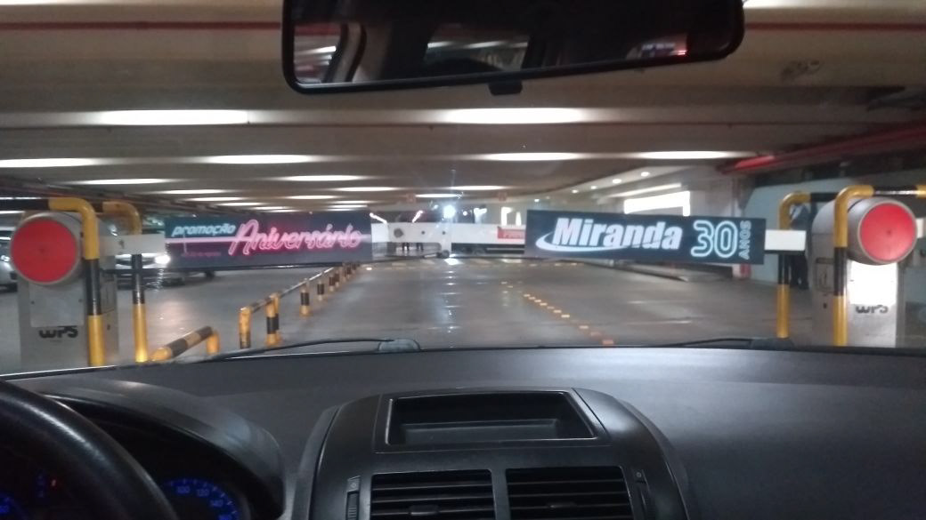
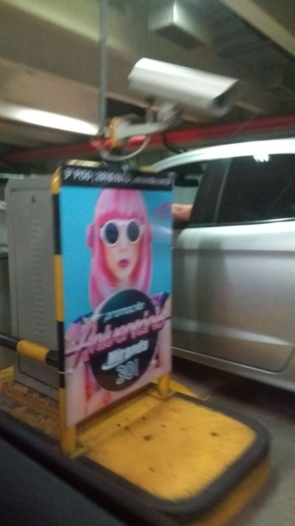
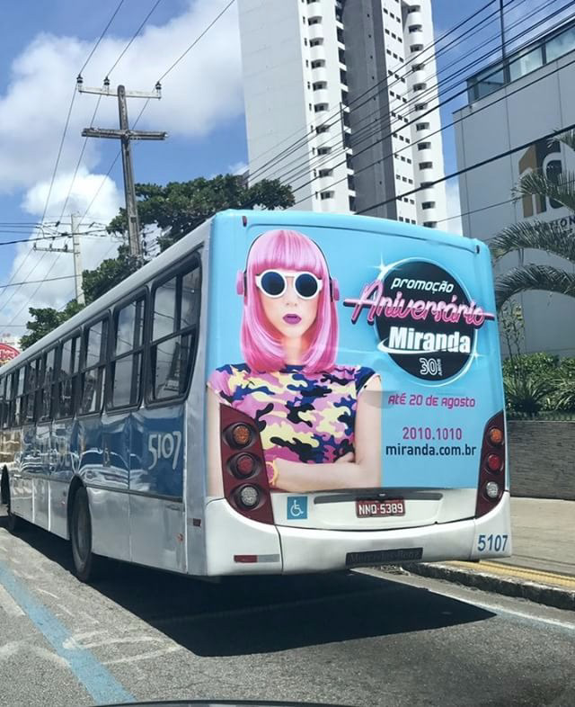
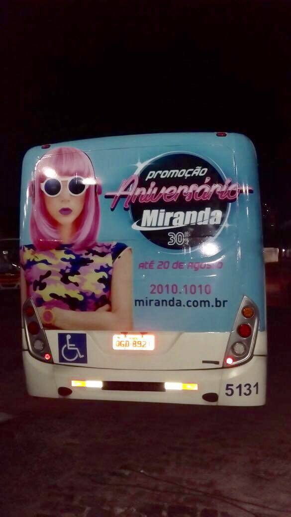
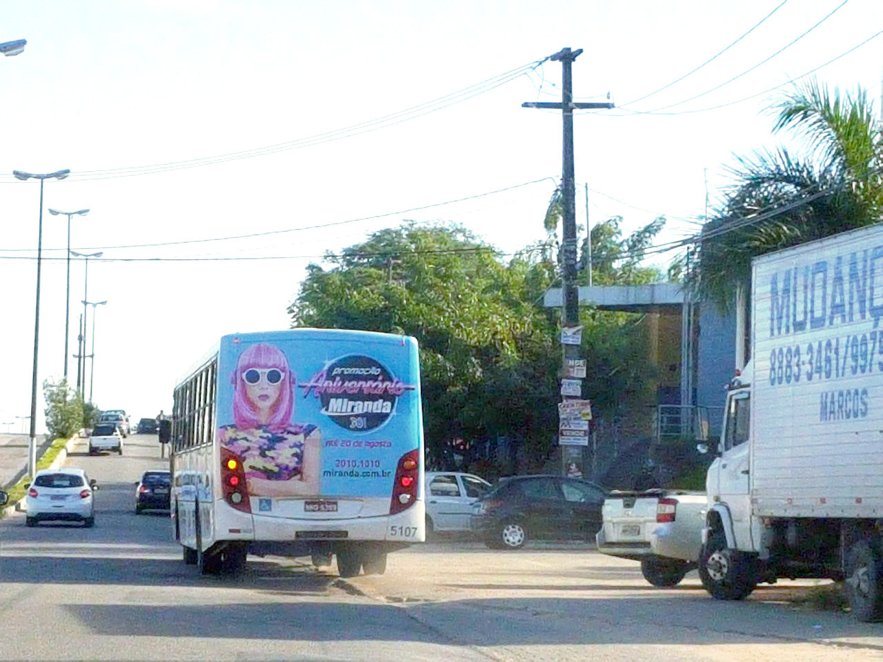
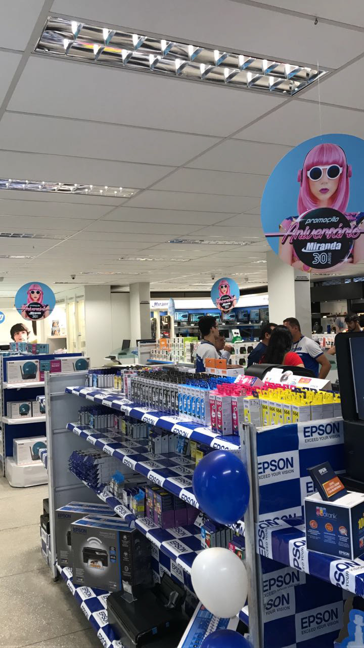
The anniversary campaign started with various media spread throughout the city, TV and internet, such as: Backbus, Shopping signs, Totens, Backlights, Portals, T-shirts, Store Showcases, Website banners, Social media (Facebook, Instagram, Twitter), Spotify , Newsletters, VTs, Radio Spot, Panneling at traffic lights, house-to-house and posted in the newspaper.


The campaign was a tremendous success, both in the media and in sales. Praised by several customers and suppliers.
"This was the best campaign Miranda ever made. The best concept. And this also reflected in sales" (Getúlio Júnio, manager of Miranda)
Héssed Martins works in the marketing of Miranda Computação and was the main idealizer of this campaign.
Team:
Creative Director & Concept Art: Héssed Martins
Editing and production: Natália Oliveira and Silvana Miranda
Digital media: Silvia Miranda
Critical analysis: Ícaro Pires and Manoela Moreira
Production of material: Art&C integrated communication
Creative Director & Concept Art: Héssed Martins
Editing and production: Natália Oliveira and Silvana Miranda
Digital media: Silvia Miranda
Critical analysis: Ícaro Pires and Manoela Moreira
Production of material: Art&C integrated communication
Disclaimer: The catalog is a collaborative production between the Marketing and Purchasing sectors of Miranda Computing and production of the Art&C agency. The other pieces are Art&C production. This is a domain campaign from Miranda Computing. All rights reserved.
To access the Miranda digital insert, click here www.miranda.com.br/aniversariomiranda